Victoria Law
3D Art Generalist
TSA Frisky
Click Here to Go to Our Website
E3 College Game Competition Finalist
Project
Our concept for this game is to achieve a fun experience for players in VR that plays well, looks stylish, and has a simple and clear enough goal for the player to work towards while at the same time sporting light-hearted humor about a typically mundane and relevant event from average life. TSA Frisky places you in the role of a TSA agent - the ONLY TSA agent on duty - and it is your job to make sure all passengers make it to their flights and are checked thoroughly for inappropriate items.
My Role
With a group size of seven students, my role is to help manage and create game design documents and make sure we meet our development and design goals. I also help with 3D modeling, some textures and materials, and FX.
Platforms
MS Windows, HTC Vive
Technology Note
Unreal Engine 4.14.1, Maya 2016.5, Adobe Photoshop CC, Adobe Illustrator CC, Headus UVLayout Pro.
**E3 Colege Game Competition 2017 Finalist**


ALPHA
Progress 1: Other than developing our initial ideas for game design and beginning the documentation process, my job was to start creating models that followed the art direction we planned to go with. We began to fill our proposed set of hero assets that would serve to create variety, interest, and humor for our game. Having so many meshes and their textures and materials could definitely be a performance concern for us later down the line, so we had to make sure that we kept things as simple and efficient as possible.

Hero assets for TSA Frisky. Responsible for all modeling in image.

Hero assets for TSA Frisky. Responsible for all modeling in image.
Progress 2: Next I started working on particles so that we could start setting up basic feedback for certain game mechanics. Most of my particles will end up being basic sprite emitters that keep in line with the stylized look of our game. I made a base for two different types of particles that we planned to have lots of different variations of - liquids and text/mood bubbles - so that I could quickly generate new ones and just replace their sprites later down the line.

Art Pass for TSA Frisky

Art Pass for TSA Frisky

FRISKY APPROVED

Poster Design

Poster Design

Poster Design

Poster Design

Poster Design

Poster Design

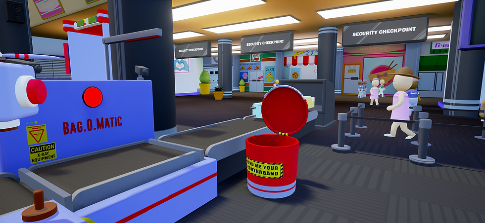
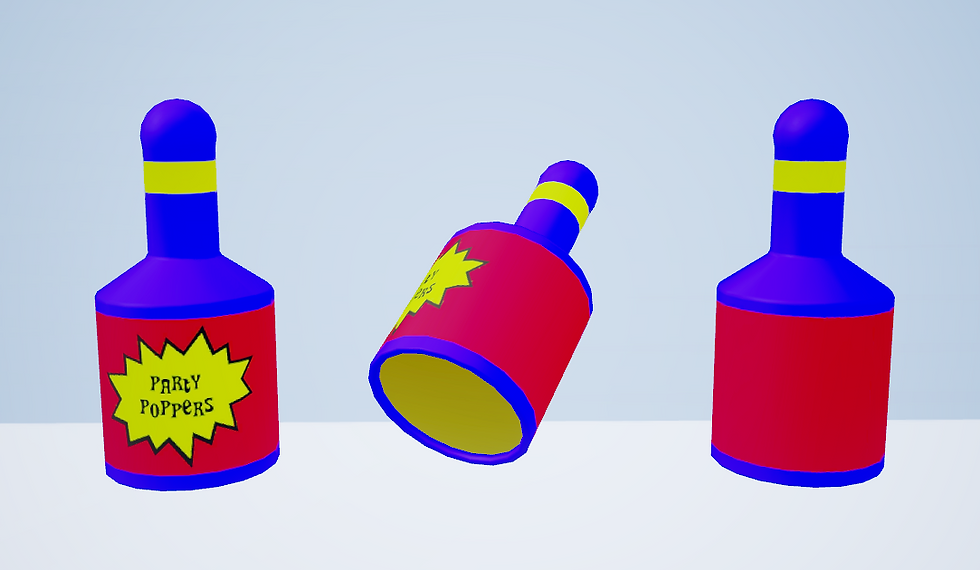
Ridiculous Bag Scanner for TSA Frisky. Responsible for all Modeling in Image except for Thumbs Up Hand Mesh/Rig, which was modeled by another team member.

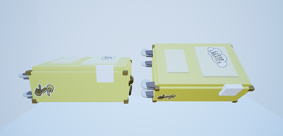
Set Dressing Items and Main Hero Asset Items for TSA Frisky. Responsible for all Modeling in Image.

Set Dressing Items and Main Hero Asset Items for TSA Frisky. Responsible for all Modeling in Image.
Progress 3: After handing off our models to our texture artist so that she could cut UVS and begin establishing our texture style, I began working on other models the player would closely interact with which were suit cases, the bag scanner, conveyor belt, and the frisking approval stamp. I also made some of the vector art for posters to fill the background environment. This progress helped lead us to our first major art pass.

Meshes for the Breakroom/Main Menu. Responsible for all Modeling in Image.

Breakroom meshes were mostly kept simple. Responsible for all Modeling in Image.

Models were made with animation and interaction in mind. Responsible for all Modeling in Image.
Progress 4: With most of the primary play space models complete or nearing completion, we could start working on the main menu space. Our main menu doubles as an interactive environment that the players can mess with. I created most of the models for this environment, again with interaction in mind, so I made sure the drawers/doors opened and their pivots were placed accordingly so the animations would go smoothly.

Our Art Team's Assets Together

Responsible for model, not texture

Responsible for texture, not model
Responsible for model and texture

Responsible for model, not texture
Responsible for model, not texture

Responsible for model and texture

Responsible for model and texture

Responsible for model, not texture

Responsible for model, not texture

Responsible for model and texture

Responsible for model and texture
Progress 5: After the primary assets for our break room/pause menu were finished, I began working with our other team artists on splitting up the texture work for assets we wanted to have finished for our beta, namely the frisk-able contraband items.
TSA Frisky (Beta)
Progress 6: After our Beta, we made sure to hammer out some gameplay design choices. Our main goals were to 1) Polish the look of our art style and environment 2) Refine game design and player/game interactions to make sure they understood our game's mechanics and 3) Continue improving our "Main Menu" for our game.

Responsible for model, not texture of bag scanner, Responsible for model and texture of board.

Responsible for model and texture.

Responsible for model and texture.

Responsible for model and texture
Responsible for model, not texture

Responsible for model, not texture

Responsible for model and texture
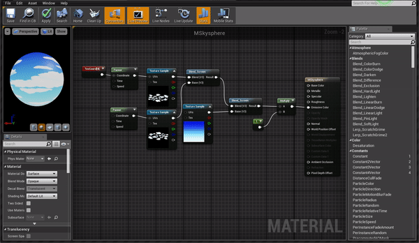
Responsible for sky sphere texture and material

Responsible for model and texture, but some textures taken from ai character textures

Responsible for models (except 4th model), not textures

Responsible for model and texture

Responsible for model, not texture

Responsible for model, not texture

Responsible for model and texture

Responsible for model, not texture

Responsible for texture, not model

Responsible for model and texture

Responsible for model and texture
Responsible for texture, not model

Responsible for model and texture

Responsible for model and texture

Responsible for model and texture

Responsible for model, not texture
For helping to polish the look of our game, we went back through old models and textures and tried to make everything feel more cohesive to one another. This involved changing models/textures/shaders/lighting/etc. It was my job to go through some of the old textures and brighten them or partially redo them. Most of our models were fine, but like some of our textures, needed minor tweaks. By this point, we also decided that our initial hope to include object interactions in the game should be cut for better scope so that our development time could be optimized as much as possible. We also decided to change our color palette quite a bit, especially for our bag and people scanners, so that they matched our floating stamp dispenser. By giving these main hero assets the same color scheme, we helped the player associate these structure for important aspects to gameplay.
For helping to polish the look of our game, we went back through old models and textures and tried to make everything feel more cohesive to one another. This involved changing models/textures/shaders/lighting/etc. It was my job to go through some of the old textures and brighten them or partially redo them. Most of our models were fine, but like some of our textures, needed minor tweaks. By this point, we also decided that our initial hope to include object interactions in the game should be cut for better scope so that our development time could be optimized as much as possible. We also decided to change our color palette quite a bit, especially for our bag and people scanners, so that they matched our floating stamp dispenser. By giving these main hero assets the same color scheme, we helped the player associate these structure for important aspects to gameplay.

Responsible for all aspects

Responsible for all aspects

Responsible for all aspects

Responsible for all aspects

Responsible for all aspects

User testing helped hi-light problem areas we needed to focus on

User testing helped hi-light problem areas we needed to focus on

User testing helped hi-light problem areas we needed to focus on

User testing helped hi-light problem areas we needed to focus on

User testing helped hi-light problem areas we needed to focus on

User testing helped hi-light problem areas we needed to focus on

User testing helped hi-light problem areas we needed to focus on

User testing helped hi-light problem areas we needed to focus on
User testing helped hi-light problem areas we needed to focus on

User testing helped hi-light problem areas we needed to focus on

User testing helped hi-light problem areas we needed to focus on
For helping to refine our game design and interactions, we held play test sessions to get feedback and brainstormed as a group what we could do to improve our game. With support from our user feedback testing, we concluded with certainty which areas we needed to prioritize tweaking. We decided that reorganizing the play space, adding visible score mechanics, and giving more visible and audible cues would provide more clarity for what the player should be doing and how their actions affect the gameplay. My role in this was helping with the playtest session along with others while taking notes and guiding the players to the user surveys we had to make sure we got their feedback. I also created our score particles and remodeled/textured our contraband board for placement above our bag scanner, because we all agreed that our interface was too spread out.


For our main menu/break room, I tried to keep design decisions in mind with the features we needed to scrap based on the amount of time we had left. Originally, we wanted a fully interactive break room with cabinets to open and furniture to break, however the player ended up spending so little time in there anyways, there was no need to prioritize those features. Certain models we had were not implemented due to spatial management concerns, but we still wanted the space to feel like a break room. Aside from following the original room-scale bloc kout reference given to me by another team member, my job was to prioritize which objects to have in there, and re-texture/re-cut the UVs of certain objects so that they'd interact with the lighting better. I also remodeled the more complex models that were initially built for interaction (open cabinets with movable doors/drawers) so that those features were removed, as they were no longer needed and they'd be more optimized with useless features cut out. It also decreased the time spent on remaking light maps. Responsible for all aspects in break room except tutorial frisk dummy mesh/textures, all room interactions, original room-scale block out, door mesh/texture and ceiling/floor mesh/textures.